In this series, we’ve been examining the 5 keys to designing and deploying an effective marketing dashboard. They are:
- Building cross-functional alignment on the role of marketing in the organization;
- Mapping the knowledge base to identify possible critical metrics;
- Providing a financial (versus purely strategic) framework for bridging short- and long-term results from marketing investments;
- Building a comprehensive brand scorecard; and,
- Designing a highly engaging user interface.
In the final installment, we turn our attention to the importance of deploying your dashboard in a way that will promote not just usage, but real interactive engagement that leads to learning.
There has been a great deal of study in the arena of human learning. In a grossly over-simplified way, it can be summarized as follows: some people can learn just by hearing; people learn more when they can hear and see the instruction simultaneously; but optimal learning takes place only when people can actually do something for themselves.
Unfortunately, most dashboards stop at the see point. They assume that the users will absorb information visually and be able to incorporate it into their mental framework for decision-making. As it often turns out, this is a huge assumption.
Excel is for Data, not Graphics
Fact: most marketing dashboards are designed (visually) by the analysts who are responsible for aggregating and manipulating the data. If you think about this for a moment, it is roughly analogous to allowing the R&D scientists who formulate our products to design the packaging or write the advertising. What they’d come out with is likely to be technically correct and accurate, but boring if not difficult to understand.
What we typically see in Excel or PowerPoint dashboards looks like the example in Figure 9 below. Technically correct, but not very visually interesting. And more importantly, they tend not to be sufficiently distinguished from the many day-to-day Excel charts and graphs managers are bombarded with in all kinds of reports and presentations– which we’ve come to understand to be of fairly little insight value through the sheer numbers we’re exposed to.
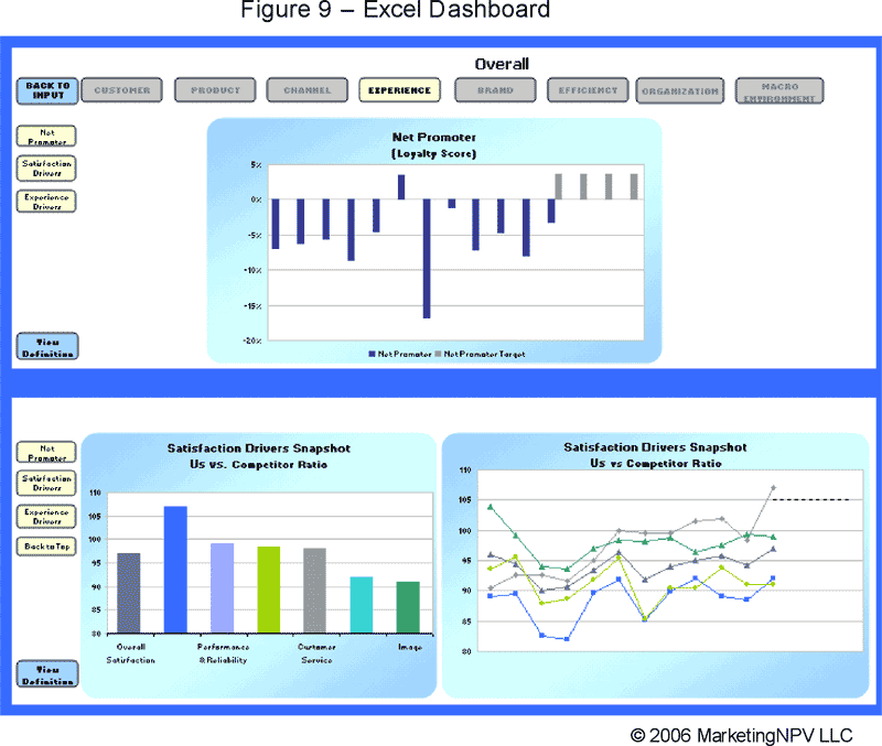
Click on image to see larger
The problem isn’t limited to Excel. It extends to the visualization limitations of most BI and MRM applications as well. There, the options for presentation tend to be a bit more robust, but the net effect is the same. Using a tool designed for data management to drive visualization is like hitting a screw with a hammer – it will eventually go in, but will ruin the wood, the screw, and, in time, the hammer.
So is it any wonder why that dashboard you worked so hard to bring to life through tireless attention to metric selection and stakeholdering is dead on arrival (or shortly thereafter) from acute user boredom?
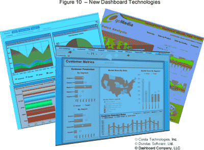
The good news is that there is an entirely new generation of dashboard design technology coming into prominence that makes it easy to grab data from any source, display metrics in a visually engaging manner, and construct an intuitive navigation framework (see examples in Figure 10 below).
This new breed of dashboard technologies facilitates the creation of dashboards that offer the user levels of interactive engagement through active data filtering and dashboard tabs that get you to exactly what you want to see, quickly. The emphasis is on navigating around dimensions of marketing effectiveness, not just drilling down to the nth degree of transaction detail. In other words, they actually encourage the user to play “what if” scenarios with the data through their visual tools. That in turns promotes real learning on the “do” level of engagement.
Many of these solutions require no pre-defined data structure and provide unlimited flexibility while offering templates for more rapid implementation. Some can even be employed as hosted solutions, eliminating the need for any hardware or software installation on your end. A few samples can be seen at
www.Corda.com
www.DashboardCompany.com
www.Dundas.com
www.Infommersion.com
Adoption, Absorption, and Application
In years of studying user interaction with dashboards, some keys-to-engagement have been uncovered that are worthy of discussion:
Adoption
The first challenge is to get the user to begin using the dashboard. This begins with an overall visual design that puts the user at ease and sends signals of simplicity versus complexity. It also requires an organization of the material in the most relevant manner to each user. Making any user visually wade through layers of dashboard content they perceive to be irrelevant to their needs (even if it is highly relevant to someone else’s) establishes a complexity barrier rarely overcome.
Adoption of your dashboard can be measured by the number of targeted users logging on; the frequency of their log-on’s; the number of metrics/pages viewed; etc. This is an important step in monitoring the initial success of your dashboard at informing the organization. Unfortunately, it’s not easily accomplished in a “file-sharing” environment in which users are encouraged to open a file stored on a shared drive. So if your dashboard is targeted to dozens, hundreds, or thousands of users, you’ll need a better means of monitoring through some sort of web or intranet access channel.
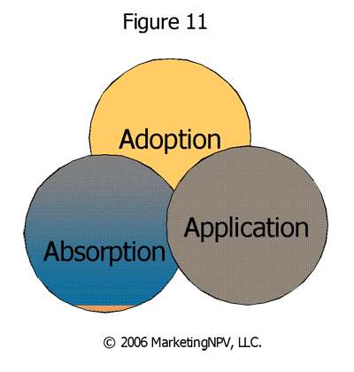
Absorption
Once you’ve confirmed that the users are actually using the dashboard, your next test is ensuring that they are understanding what they are seeing. There are three dimensions to understanding:
1. I know how to read and understand the metrics I’m looking at;
2. I know how to interpret the information in the metrics;
3. I know how to filter the data within any given metric and navigate between them.
Adoption without absorption is a fatal flaw. It signifies a dashboard in which the emphasis on creating simple design over-shadowed the attention to knowledge-building. The result is an early pattern of high levels of adoption, followed by a rapid deterioration of use and eventual abandonment.
Absorption itself is too often assumed. Dashboard designers have a tendency to release their dashboards without sufficient user-feedback testing to confirm not only that layouts and navigation structures are self-evident, but that the user understands what they’re looking at and how to manipulate it by geography, segment, timeframe, or any other dimension available.
The best way to gauge absorption is to sit alongside a sampling of users as they navigate through the dashboard. In a testing session, you can create contests and award prizes for people who can filter and navigate their way to answer some questions about the status of the business. If they struggle, you’ll know you still have some work to do. With executives (who may be reluctant to engage in these types of “games”), you’ll find it helpful to offer a 30 minute personal introduction to the dashboard and sit alongside them while they navigate to find things you challenge them to locate. During these sessions, resist the temptation to touch the mouse or keyboard yourself. Let them do it themselves to get a true reflection of what’s likely to happen when you leave their office.
Application
Application is the test of how the insights being derived from the dashboard are getting incorporated into daily business decisions. It’s a bit more difficult to measure, and requires the participation from some of the users themselves.
Draft a dashboard steering committee of a few accomplished users. Then spread out around the company, watch, and listen. Go to meetings. See presentations. Review business cases. Look for evidence that elements of the dashboard are being incorporated (either directly or indirectly) into recommendations people are making for their strategies or tactics. Verify that the information is being used correctly and comprehensively, and not just applied selectively or excerpted to support an otherwise pre-conceived recommendation. Then come together periodically as a group and compare notes on what you’re seeing and observing, and how it might suggest you modify your dashboard, the training programs, or both.
Tying It All Together
The goal of any marketing dashboard implementation is to elevate the knowledge of the organization; highlight gaps in key areas of understanding; and improve the speed and quality of decision-making. Accomplishing these is a matter of:
- Measuring what you should, not just what you can;
- Being comprehensive and looking under any rock that might provide insight, yet selecting for your dashboard only those metrics with the most predictive or diagnostic insight;
- Developing a vision for what knowledge you need and a roadmap to get you to it – one piece at a time;
- Keeping a clear line of sight between marketing metrics and the financial impacts for the company;
- Stakeholdering key opinion leaders and constituents both within and beyond marketing on the meaning and implication of critical metrics; and,
- Deploying in an engaging, intuitive, and relevant manner that makes people want to interact with the tool.
Having done this many times for many types of companies, I can assure you that what may seem to be a daunting task in these terms melts away into a series of step-by-step accomplishments which are each manageable in their own scope. If you let the 5 keys in this series guide your dashboard development, you’re likely to find yourself on a much higher plane of marketing accountability and insight in as little as 6 months. At the very least, you’ll be asking much better questions.
Pat LaPointe is Managing Partner at MarketingNPV (www.marketingnpv.com) – a highly specialized consulting firm that builds marketing measurement frameworks, analytical processes, and marketing dashboards for Global 1000 companies across industries. He is also the author of Marketing by the Dashboard Light: How to Get More Insight, Foresight, and Accountability from Your Marketing Investments.