Today, you’re only as good as your 320-pixel wide display. But supporting mobile as a separate version of your brand experience raises costs—and confuses customers.
Keeping desktop and mobile web experiences separate also makes it harder to add new markets and languages, shortening your brand’s reach in global markets. After visiting the sites of 2,657 websites of global companies in 2016 and studying the design principles behind the 150 websites with 25 or more languages, Common Sense Advisory (CSA Research) found clear evidence that “here is a better way. An elite crew of digital natives are exhibiting a new collection of traits that other brands would be well-advised to adopt.
Of the 12 companies surfacing a brand in 45 or more languages, 11 manage their brand website as an app experience, rather than displaying “pages.” The brand.com site looks and feels and functions like an app that loads in your web browser. Microsoft (Bing.com) and Google are the old-timers in this clique. The obvious global titans like Toyota and Nestle and GSK manage phonebook-sized websites, with lots of pages. Once a brand crosses the blood-brain barrier between websites as pages into site as app, several more important revelations follow.
The first principle is a single experience across all devices. This doesn’t apply to all web apps, but it does apply to brand.com as app. RWD, or responsive web design, means that there’s no longer a requirement that desktop and mobile be managed as separate versions of the customer experience. Eighty-seven percent of those with 25 or more languages offered RWD experience in at least one country or region, but only 62 percent offer it in all markets. Thirteen percent still offer no support for small screens. Sites providing the best customer experience go beyond responsive—they enforce a consistent customer experience across all platforms and screen widths.
One experience on all devices matters, because many first visits and new journeys begin with a mobile search. Sites that look and function like apps get more engagement and the transition from browser app to downloaded app is a shorter step. The most forward brands don’t stop at “mobile first” development, they eliminate other code and design branches; they no longer develop anything else. The desktop experience simply becomes an expanded version of the original mobile experience. In this sense, they bring their mobile experience “forward” onto the desktop, thus, becoming a mobile forward design (MFD).
It’s All About the Customer Experience
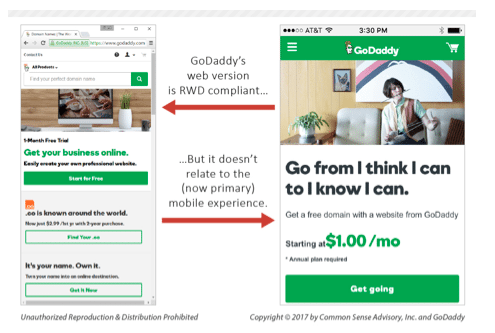
Maintaining separate experiences for desktop web versus mobile web also affects the customer, negatively. Visitors want to swap screens and devices without changing how they interact with a site. The bottom line: same customer experience is better customer experience. Sure, there are specialized apps you might connect to where a different desktop experience is appreciated – just not the .com app. There can be extras that appear in a desktop browser, but it shouldn’t look unfamiliar. In the figure below, godaddy.com makes this mistake. If someone notices an offer or a start-point on their mobile during the commute, and then hit the site again when they get to their computer, they expect to see the information flow and same call-to-action.
Smooth Sailing
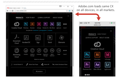
The second principle is same experience in all markets. Outside of large countries like the United States or the UK, a majority will likely be non-English speaking or multilingual. These non-English consumers may travel between countries for work, family, or vacation. Prospective customers and prospects can pop up in any country, in any language, and, like screen-hoppers, they, too, expect to find the same functions and same experience, even when the content itself is adapted and fresh for that market. In the second figure, adobe.com serves up the same experience for all devices, in all markets.
And just as “single experience on all devices” comes with benefits (lower costs), “single experience in all markets” also spreads the joy. When all markets run on a single content and experience delivery platform, brand.com can add new languages faster. It’s easier to achieve ROI, it takes fewer resources, and the velocity of new content and feature launches goes way up. This in turn improves SEO and social engagement for brand.com in global markets. In summary, the capability to quickly release new functions, campaigns, and content across all devices and all markets brings a competitive advantage for global brands.
Benjamin S. Sargent is a senior analyst at Common Sense Advisory.
Related Articles:
How Wish.com Goes Global in Mobile
Mobile Budgets Up: Adobe Survey
Marriott’s Mobile Strategy Rings Up $1.7 Billion in Bookings Annually
 Network

