 Have you ever looked at your marketing and wondered, “Why did we cram in so many features? Wouldn’t it be better to focus on something simple?”
Many marketers have a hard time making that call. Focusing your campaign on one bullet point—perhaps just one aspect of one product—limits the customer attention you can attract to other important (and often large revenue-producing) parts of your portfolio. From a risk-limiting point of view, this can look like putting all your company’s eggs in one basket.
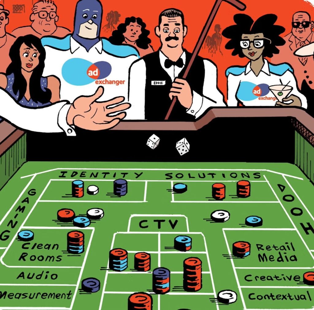
And on some level, that’s what it is. You’re betting on the killer feature you believe is your strongest sell. You’re taking a big risk.
From my experience, most marketers will never take that risk. But here’s why you can stand out if you do.
Clean, simple, and obvious
Every car has 10,000 features worth selling. But when you go to the Audi or BMW websites, for example, you only see one or two things featured on the home page. That’s because smart marketers know the laundry list belongs further down the sales funnel, after you’ve already attracted the customer’s interest.
Feature lists don’t grab attention; they feed it once it’s already there. But at first contact, you’ve got to take a calculated risk. You’ve got to put one attention-grabber out front.
Whole Foods is a company that handles the routine with expert skill. In their weekly mail-out circulars, they’re front and center with their loss leaders for that week, the respective sale prices, and not much else. They take a risk on the message that matters.
The moment you start letting extra messages in, on the other hand, your brand message gets diluted. Customers instinctively filter out most marketing content these days, so why make your brand even easier to ignore by giving the customer unnecessary information?
Customers who want more detailed information will go looking for it anyway, and you should always make that available somewhere—on your website, for example—but details shouldn’t be what’s right out front. They’ll only make your product harder to remember.
You’d think that keeping things simple would be a no-brainer. Which begs the question of how all this drag on your messaging builds up in the first place.
How simple messages get complex
On some level, this behavior arises out of simple risk-averseness, which manifests as a scrambling attempt to make every customer happy.
One sector where you can really see this is the film industry. In the summer, major studios roll out tent pole blockbusters designed to rake in huge profits in almost every domestic and international market. In other words, studios’ goal is to release a product that’s just minimally viable for the maximum possible number of moviegoers.
The result of being this risk-averse, though, is that no single audience group really feels the movie was created with their interests and passions in mind. The movies sometimes turn huge profits overall, sure; but fewer customers connect with the product on a personal level. This has a somewhat paradoxical effect: as a studio packs more “features”—special effects, stars and so on—into a movie, the film’s message gets more diluted, easier to ignore, and less emotionally impactful for audiences.
As products mature over their life cycles, marketers find ways to complicate things that are actually really simple. Sometimes we marketers get so excited about new features that we start to sound like the hosts of late-night infomercials, always shouting “But wait! There’s more!” And that’s potentially lethal for a brand message.
Which is why, eventually, you find yourself in a meeting to identify the top one or two features to focus on in your campaign, while staring down a list of fifteen no one’s willing to cull down. That’s when you know it’s time to fight back against messaging drag.
The way to fight back
With a data-driven understanding of real-world customer behavior, it’s easy to see that simpler messages make stronger impacts—and that makes the concept of a “one bullet” brand message an easy sell, both up and down the chain.
Website eye-tracking studies consistently find that browsing patterns tend to fall into “general browsing” and “goal-oriented” modes. A customer who’s in browsing mode is scanning all over the page, ignoring most ads, but soaking up any content that looks interesting, then maybe diving deeper if a feature catches their eye. These people don’t really see the marketing copy on a site.
A customer in goal-oriented mode, on the other hand, is scanning for specific information, then clicking through as soon as they see it. These customers are more likely to read the details, because they’re already primed to learn more about the product.
The implication for marketers is clear: People looking for all the bullet points will go searching for the features list anyway—but those just browsing are looking for a simple reason to dive deeper.
The way to start fighting back, then, is to see your product through the eyes of someone who has no prior interest in it. They’re tough to convert. But they’re the people you’re not reaching—and who’ll respond most strongly to a simple message.
So create a singular message. Present it simply. Stick with less. The people who are interested will come to you, and you can continue the conversation from there. But to see the power of this approach, you’ve got to start by taking a risk.
Mark Grilli is vice president of product marketing for Adobe Document Cloud.


